The Precast Show Rebrand
Team members of NPCA (National Precast Concrete Association) came to us at CVR for a rebrand of their annual precast show that brings together thousands of manufactured concrete industry professionals.
The goal of The Precast show was to bring small groups into one big event and to have a new brand package to bring excitement and recognition.
The client wanted a level of distinction, inclusion of more than just precast, highlight this as “the” premiere show. How could we show quality, versatility, sustainability, strength, and durability?
Because this was an industry I wasn’t fully involved in, I researched what precast was, what types of precast were available, etc. I in particular was asked to look into precast, prestressed, rebar, masonry, and interlocking. From these ideas I created a word cloud and from that I pulled the following words: strong, any shape, forms, solid, horizontal/vertical, and layered (rebar + concrete).
For design inspiration, I looked at structures and patterns created by precast items.
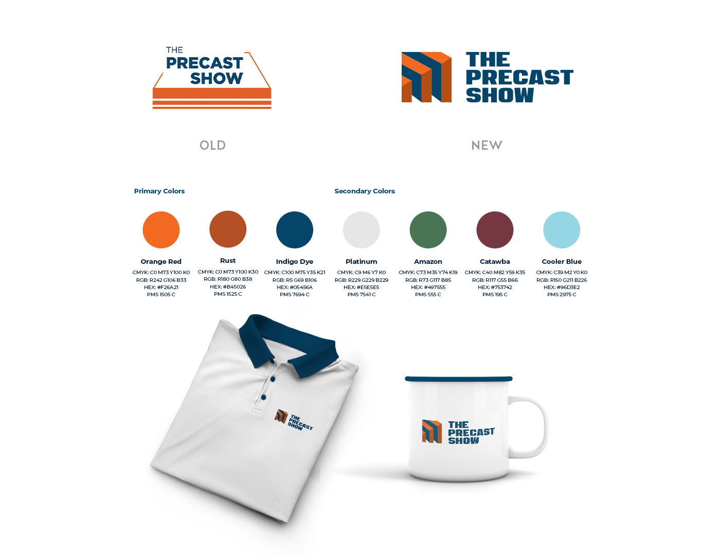
The old logo had some good elements with the idea of the slabs. So to make it more visually interesting and dynamic, I changed the perspective. We wanted the logo to show strength, structure and form in a more modernized nod to their old look. And, the negative/blue spaces play with your eyes to create 3D shapes.
Once we all came to an agreement on the logo design we created several collateral pieces to help with advertising the upcoming show: email templates, social covers, and save the dates.
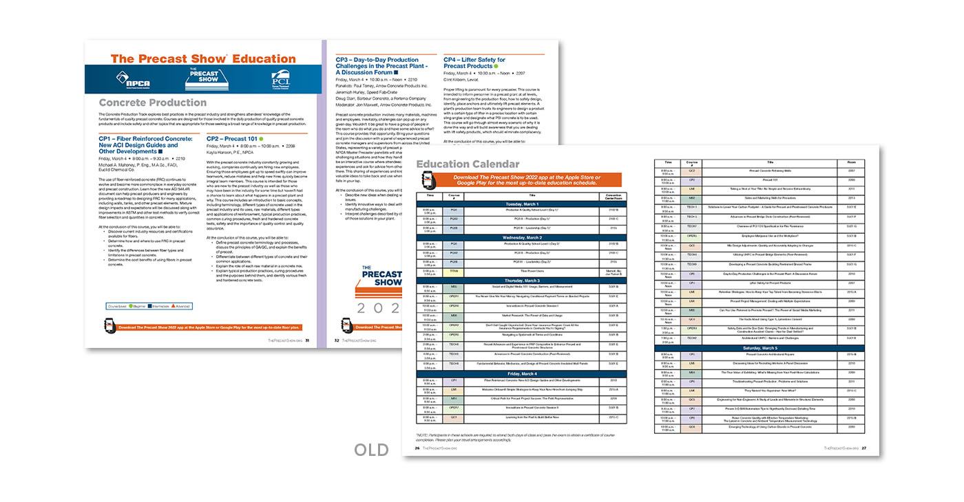
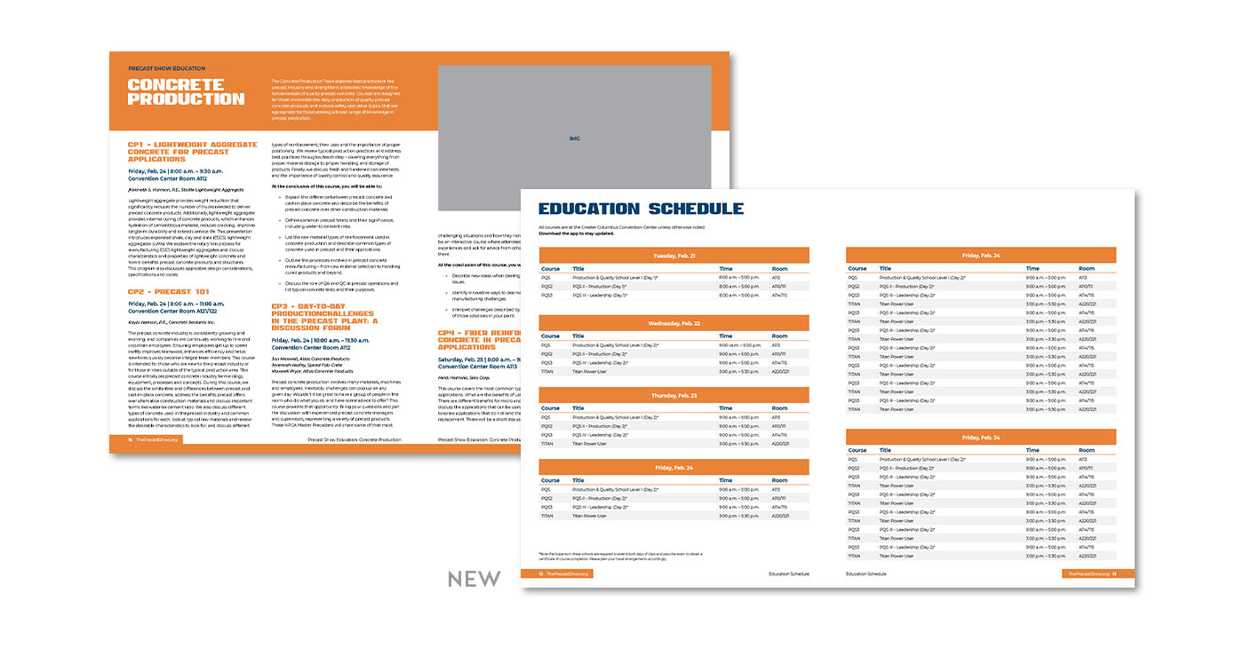
And, around a year later, we designed a new show booklet template for the NPCA team to use for the event. This booklet gives viewers all the information they need for the several days that The Precast Show event runs. We were able to redo their layouts to create better visibility among the different sections of information and better organize large tables of information.