Maison La Belle Vie Winery Wine Labels
A past co-worker had contacted me to see if I wanted to work a freelance job for a winery. I’ll give you a hint, the answer was, “YES.”
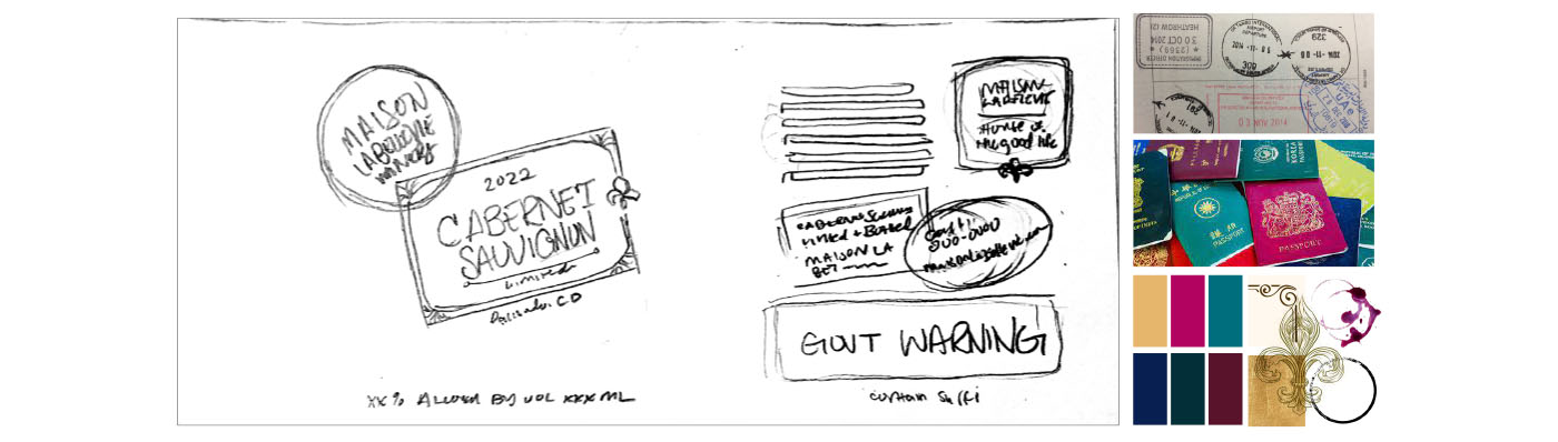
So, in early 2022, I primarily worked with my past co-worker who was my main contact about this job. After getting the initial wants from the client, I worked on a mood board and a sketch to make sure we were going in the right direction.
Here is a snippet of what I shared from my mood board explanation:
For the “passport with entry stamps” type of design, I wanted to frame certain pieces of information on the label like the wine name, year, and location to mimic entry stamps. I also wanted to frame Maison La Belle Vie Winery as a stamp overlapping the wine since the logo has a nice text shape and outline similar to stamps. This gives the front label a cluster of stamps, well-traveled, but still clean and organized.
As far as the back label, some elements can live in a “stamp,” but I wanted to make sure that the government warning stays neutral and standardized. Things like the translation of Maison La Belle Vie, if listed on the back label, could create some fun stamp shapes.
After the mood board and sketch feedback, I gave them a label design that fulfilled their vision. This label was used as a template for their future wines. I picked colors and textures based on the mood/feeling of each wine type.
Since we have a white blend, I used teal, deep violet, and golden yellow to complement the yellowy tint of the wine in the bottle. I created a few shapes to use as stamps and kept the type/text clean (without many drips/blooms of ink.
The background has a paper texture along with a wavy, repeating texture that adds some more cool tones to the design since it will be up against the color of the wine.
I was then asked to create a more grungy, pirate map-like label for red wine, yet still similar to the white label.
For red wines, I suggest using the blue-violet, maroon, and fuchsia colors to complement the warm red color of the wine itself. The layout mimics the white label with some burns/tears, weathered paper, and the texture of an elevation map.
I added a new stamp surrounding the wine name on the label and more stamps to this label compared to the white label, making it look a little more well-traveled.
And, I had suggested a die cut along the top and bottom – giving this a higher-end look and adding to the distressed effect on the label.
Maison La Belle Vie Winery owners are wonderful people, and I hear they have some great wines with labels designed by a cool person 😉