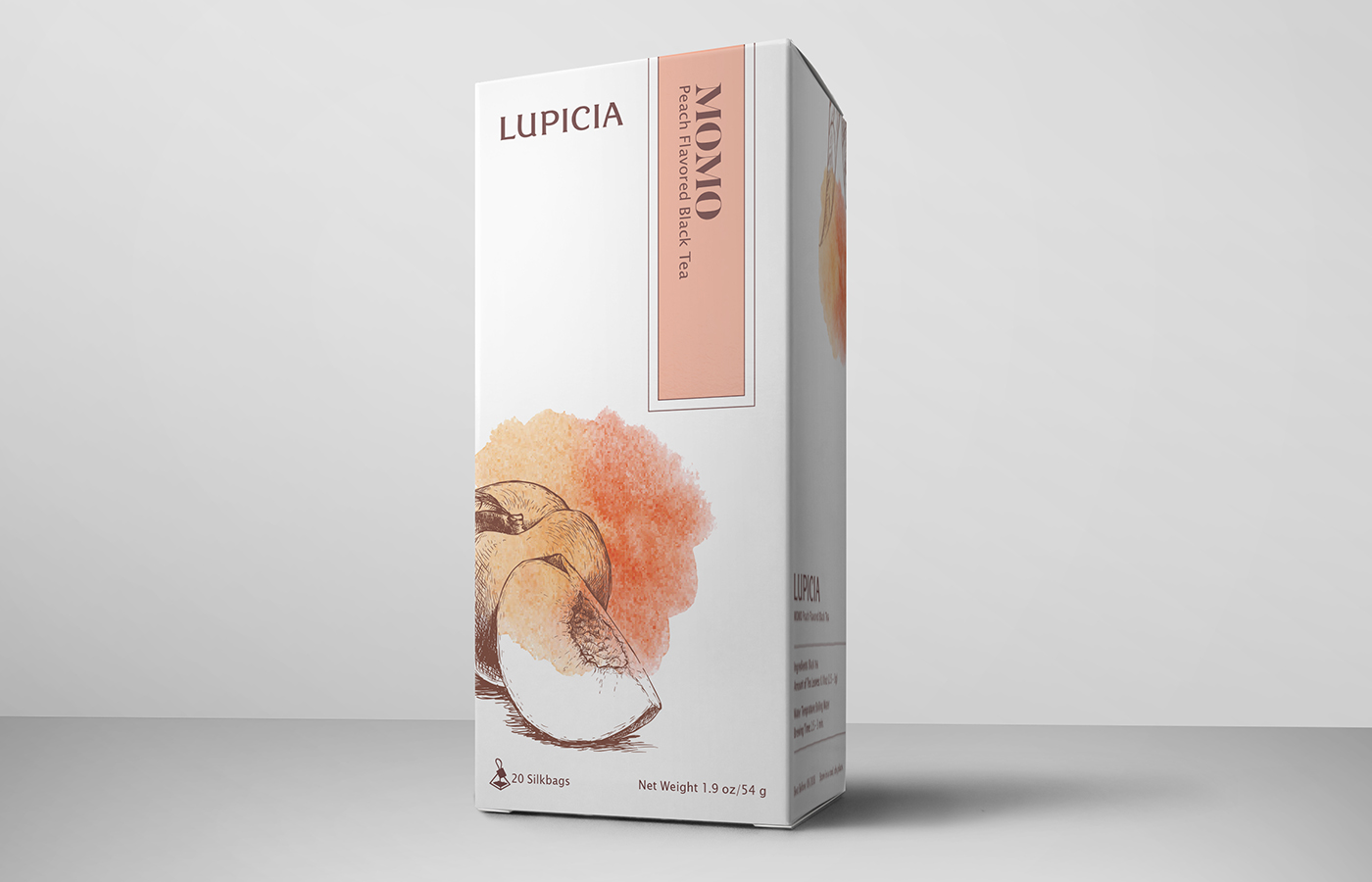
Lupicia Momo Peach Tea
This project was to create a 2 3/4″ (w) x 2 3/4” (d) x 5 1/4″ (h), 20 tea bag box package for Lupicia tea product.
“About Lupicia – Lupicia offers more than 400 kinds of fresh teas throughout the year, ranging from seasonal teas to our original blends of flavored teas. Our mission is to offer the highest quality teas possible as well as deliver new varieties and flavors to people throughout the world.”
Goals of this Project:
Create a system, the design must work across a family of teas.
Type must pair with a style of imagery.
Design must not be reminiscent of existing teas on the shelf.
Separate the box from the competitors and communicate that it is Japanese in origin.
Position the brand at a premium level.
Color Research – Symbolism in Japan
Pink: Spring, feminity, youth, good health
Brown: Earth, strength, durability
White: Purity Truth
Circle Meaning – Symbolism in Japan
Ensō means “circle”: zen, enlightenment, strength, elegance, universe
Open Circle: Incomplete, movement/development
Closed Circle: Perfection
Once drawn, a circle does not change.
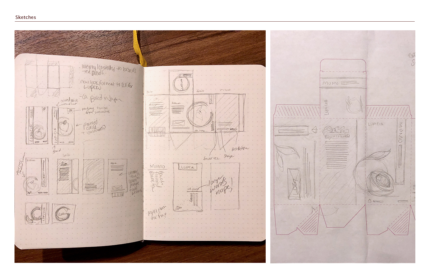
I was able to get initial feedback from a professional on my design. I had some issues with alignment of text, design elements competing with lighter elements of the design, typeface choices for small text, and color.
So, I went through and updated artwork to reflect those changes.
I’m glad I updated because the design looks more light & natural, especially with the dark brown instead of the black. And, updating the typeface to a sans serif helped with legibility. I also carried the design on the far right panel to the left to continue the overlap of designs that I have going on throughout the piece.