Mobile Air Plane Boarding Pass
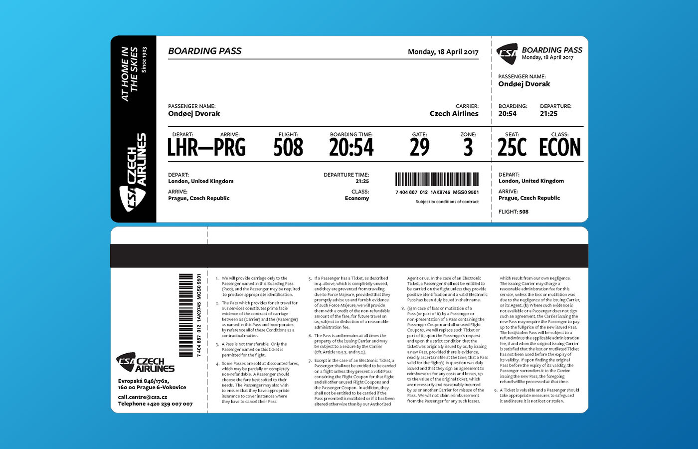
This project was originally a Typography Secrets of Six-Figure Designers Facebook group project that I turned into a learning experience for myself. The original project was to design a paper boarding pass with provided content.
A little background story: Recently, I had taught myself how to design in Adobe XD – I had never designed for websites (other than my own personal portfolio site) and honestly I wasn’t really that great at it. At Valve + Meter, a good majority of what we do for clients is redesign their websites, so, I had to learn really fast how to wireframe and mockup design comps for a developer.
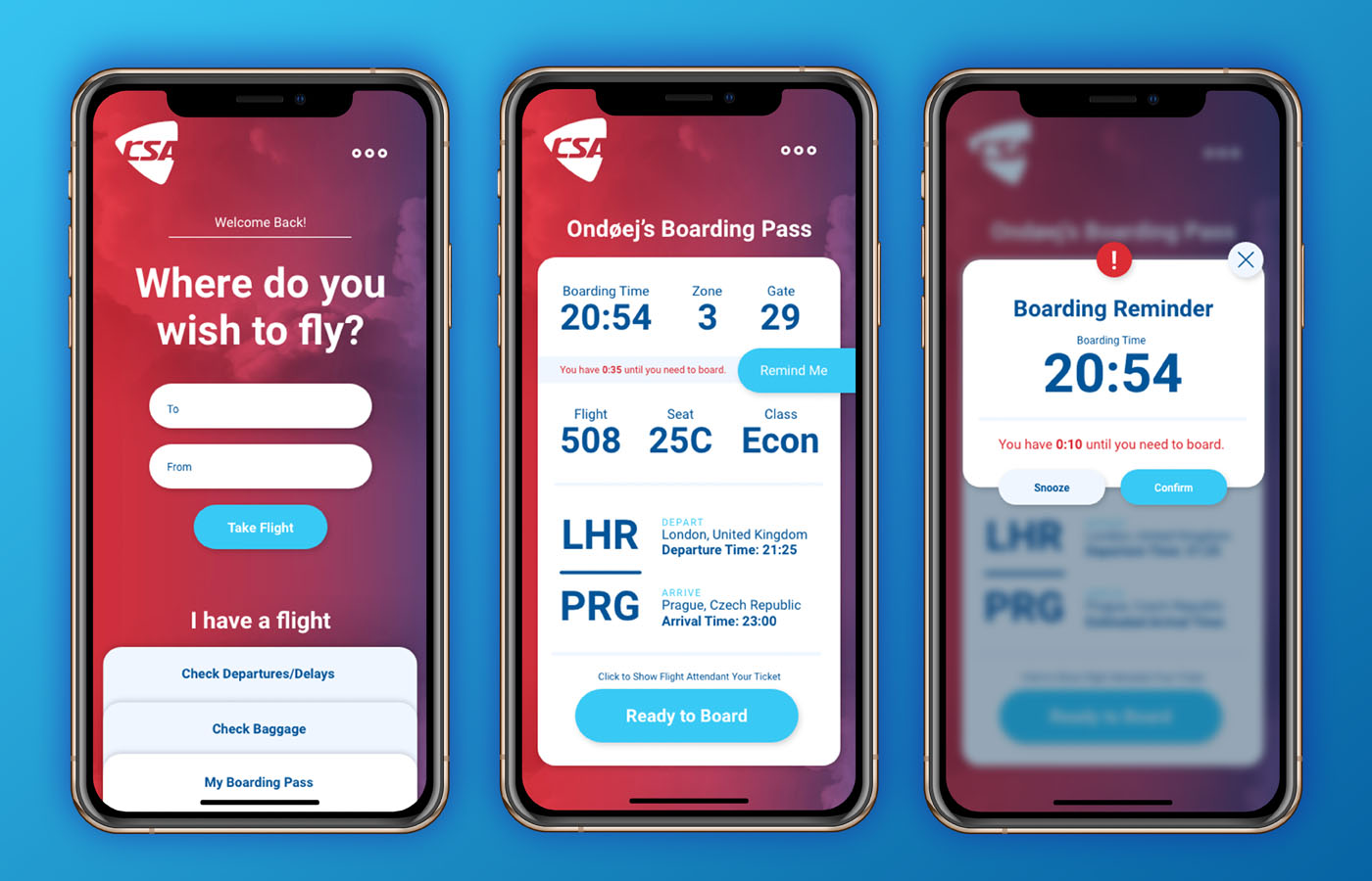
Once I got into Adobe XD and “figured out” this UX/web design thing a little bit more, I wanted to challenge myself and try something. So, I pulled the paper boarding pass and tried to think through how I would want to navigate through a boarding pass app. I added a feature to set a reminder X amount of time before you need to board and small visual cues to let you know that.
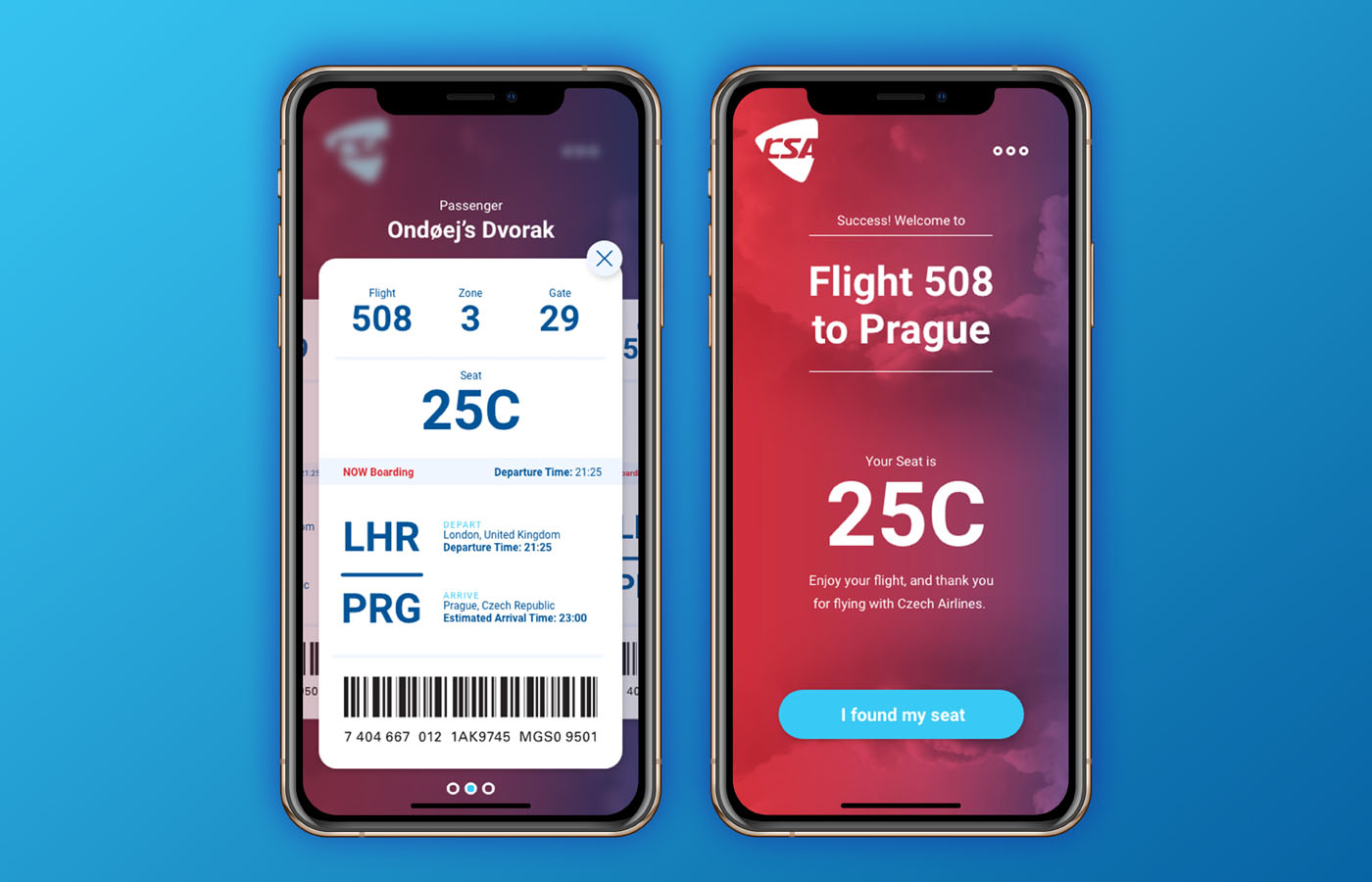
I also made the app only show what you needed at that time, utilizing hierarchy. Before boarding you wold see your time, zone, and gate right away, and you had a CTA to set a reminder (optional) and a CTA to board, when the time came. Then, once you were ready to board, a boarding pass card with your barcode and seat number were the most visible elements – barcode for the flight attendant to scan and then your seat so that you’re ready to get flying. And, I thought it might be an interesting feature to have, after the barcode was scanned, was to have your seat number large and a CTA to let the attendants know if you found your seat. I’m always open to critiques, so if you have any suggestions please let me know!